Our friends at Ethos3 have been working for years to fight against the dreaded “Death by Powerpoint.” We caught up with Ethos3’s content writer and blogger Maggie Summers to hear her thoughts on simplicity, and how Haiku Deck can help further the cause.
Haiku Deck: We’re certainly aligned in our quest for simplicity! Tell us more about your take on it.
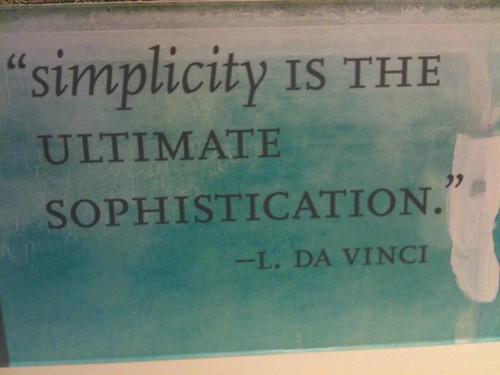
Maggie: Leonardo da Vinci once said, “Simplicity is the ultimate sophistication.” The very existence of simplicity implies thorough understanding, as well as thoughtful inclusion and careful omission. It’s far easier to maintain complexity than it is to foster simplicity.
Distilling complexity is worth the effort. Ideas are far easier to understand when they’re presented simply. Points are more easily retained when there’s no clutter or extraneous jargon. In reality, most people just turn off and tune out in the face of complexity.
Haiku Deck: And what are your thoughts about Haiku Deck in particular?
We’ve been huge proponents of simplicity since the beginning of Ethos3, so we’re really excited to see this app come into the presentation space. Haiku Deck is essentially a manifestation of the presentation designer’s most important commandment––use big visuals with little text. We think it’s a great resource for the at-home presentation designer striving for simplicity.
Haiku Deck: What’s your advice for people who’d like to simplify their presentation style with Haiku Deck?
Maggie: Don’t be intimidated by Haiku Deck’s two-line per slide limit. Really, the app is doing you a favor by encouraging the use of as little text as possible to convey a point. It forces you to weed out the complicated, and find the simple. How can you disseminate that point in five words instead of ten? How can you narrow that message down into a single, pithy line rather than squeeze it into a bulky two? Simplify.
The two-line limit becomes much less daunting if you restrict yourself to including only one point per slide. There’s no such thing as a presentation that’s too long or too short. In fact, try not to think of length in terms of number of slides at all. More often than not, expanding a 25-slide presentation into a 50-slide presentation presents the same information much more effectively. The quantity of slides isn’t important. The memorability and impact of each individual slide in the deck is what truly matters.
Haiku Deck: What tips do you have for using images effectively?
Maggie: Large visuals also help the presentation designer embrace simplicity. Use visuals that support and nuance the point on a slide. Don’t be overly literal or prosaic with your choice of images. Instead, play up visual metaphors and use humor, irony, and unexpectedness to add depth to the words on the slide. Use text to communicate the essence of your main point, and then use a compelling visual to communicate further its meaning.
Haiku Deck: Any last thoughts?
Maggie: The simple resonates with audiences much more quickly and resoundingly than the complex. Where complexity tends to alienate and dissuade, simplicity implies accessibility and thoughtfulness, inspiring an equal chance at understanding for all.
Here’s a lovely Haiku Deck that Maggie created to capture her thoughts on simplicity:
Simplicity – Created with Haiku Deck, presentation software that inspires
For more tips on embracing simplicity, you might enjoy Maggie’s thoughts on how a presentation is like a backpack on Ethos3.
Would you like to do a guest Q&A for our blog? Please get in touch: catherine@haikudeck.com.

