Last week we noticed a Twitter comment from Joby Blume, managing consultant at Bright Carbon, that Haiku Deck could encourage the selection of “near random” imagery that might ultimately weaken presentations. We invited him to elaborate on the topic in this guest post, and he graciously shared his expertise and insights.
Haiku Deck: What’s your philosophy on presentation design, in a nutshell?
Joby: Well, first of all it’s important to note that a presentation is more than just the slides – a presentation also needs a presenter. People seem to forget this basic point – slides can be put on SlideShare, or emailed – but without narration that’s not the whole presentation, it’s just the slides. The best way to design slides for SlideShare isn’t the same as the best way to create slides to actually use in a presentation.
A presentation needs to make the most of the interplay between slides and presenter. If the slides are self-explanatory, then the presenter gets ignored while the audience just read for themselves. If the slides aren’t relevant or helpful, then the presenter ends up giving a speech, not a presentation. There needs to be a balance – slides should help audiences to understand what’s being said, without making the presenter unnecessary.
Haiku Deck: What most makes you cringe in a poorly designed presentation?
Joby: There are levels of poor presentation design. Most slides are awful – full of text, often in font sizes that can’t even be seen by the audience. That’s the bottom level of awful. People who just never even thought about what they are doing too much, and used PowerPoint to type – just because they can.
Not like this. (Creative Commons licensed image by Oran Viriyincy)
Quite a lot of people are starting to understand that bullet-points don’t work, and are moving away from text-heavy slides. But what people do instead doesn’t always work either. It isn’t enough to stop using bullet points and assume that every slide you create will be awesome.
I saw a slide yesterday with six separate diagrams on. It looked professional in the sense that I think a graphic designer had created it, but they hadn’t thought about the unique medium of presentations. I think the logic of cramming things together was to try to keep the number of slides down, but it’s better to have more slides and present them faster. Where was the audience meant to look when shown six diagrams at once? The slide was un-presentable, even though it wasn’t text heavy at all. Slides don’t just need images – they need the right images.
Haiku Deck: You mentioned that the increasingly popular “zen” presentation style can lead to some pitfalls. Could you elaborate on that a bit?
Joby: When Steve Jobs stood up to launch the iPhone or iPad, he could show beautiful images of the products behind him on stage. These product shots were relevant – they were photos of what he was selling. And of course Steve jobs didn’t need a lot of support from his slides – he would have been confident standing up on stage and giving a speech anyway.
For the rest of us, things aren’t as simple as that. We can’t show product shots if we aren’t talking about products. We might not feel comfortable giving a speech. We sometimes need our slides to help us get the point across, but we can’t do that if we put up a beautiful picture of a snow-capped mountain when we are talking about complex derivatives. It’s the manatee problem – where slides look like they have been created almost at random with pretty photos and buzzwords that are too far removed from the actual message.
For the rest of us, things aren’t as simple as that. Unless you’re promoting the fastest payout online casino or something where the image is the message, we can’t just put up product shots if we aren’t talking about products. We might not feel comfortable giving a speech. We sometimes need our slides to help us get the point across, but we can’t do that if we put up a beautiful picture of a snow-capped mountain when we are talking about complex derivatives. It’s the manatee problem — where slides look like they’ve been created almost at random with pretty photos and buzzwords that are too far removed from the actual message.
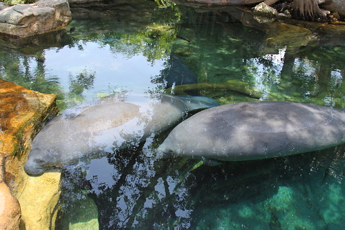
Ooo, pretty. (Creative Commons licensed image by JessieHarrell)
Joby: If you are giving a zen style presentation, using Haiku Deck or “the hard way,” ask yourself two questions:
- Does this image actually help the audience to understand what I’m saying?
- Would this image need to change if I was saying the exact opposite of what I’m trying to say?
If the answer to either question is “no,” then think about finding a more relevant image. Your slides need to be more than decoration. Don’t be scared to find or make some images of your own – create a chart, or sketch a diagram. Sometimes that’s the best way to explain your message. You can still use your own images in Haiku Deck – don’t worry!
Haiku Deck: What’s the best presentation you’ve ever seen, and what did you love about it?
Joby: For a conference-style presentation (on stage, with a large audience), perhaps Dick Hardt’s Identity 2.0 talk:
The slides aren’t beautiful, but they support the message, and presenter and slides work in perfect harmony. There’s an incredible number of slides – but they only show for a second or two each. It works.
The best presentation I’ve seen to a small group was really more like a visual conversation, with a lot of interactivity and back-and-forth. Seeing my colleague Richard having a visual sales conversation while using an iPad is pretty awesome.