GET STARTED SIGN IN PRICING GALLERY

Haiku Deck Classroom Partners with Google Education at ISTE

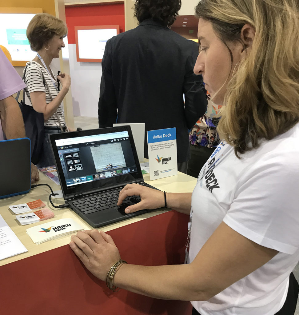
Haiku Deck’s trip to ISTE was a success! Our partnership with Google Education gave us the chance to connect with educators from around the world. We learned more about teachers’ needs and the unique ways they use Haiku Deck Classroom.

Google Booth at ISTE

In the Google Education booth we shared tips and tricks with teachers, technology coaches, and school administrators from all over the United States and as far away as New Zealand. They learned the various ways Haiku Deck is integrated with Google Classroom and how it benefits students.

Google Booth at ISTE

Google for Education now features Haiku Deck in their new Chromebook App Hub, built for teachers and students. Our Chrome-optimized web app is closely integrated with Google Classroom roster sharing, Google Sign-In, YouTube, Google Drive, and Google Photos.

Haiku Deck Classroom is simple and affordable to use with a classroom management dashboard; course galleries for reviewing presentations; sharing with LMS systems; and subscriptions that work across hand-held devices, Chromebooks, and web browsers.

Our app encourages best presentation practices by helping students simplify their message and present data clearly. Learning is fun with photo and video embed features and access to over 40 million Creative Commons licensed images. Our tool automatically imports image attribution, promoting good digital citizenship. Discover what teachers and students have to say about Haiku Deck in the classroom:

Haiku Deck Classroom

Creative Ways Coaches Use Haiku Deck Presentations

While conference rooms, classrooms, and auditoriums might have been the original setting for slide decks, those are in no way the limits of their utility. Coaches especially have found a myriad of ways to use slide decks — from “About Me” pages, to instruction manuals, to blog title graphics. These uses of slide decks save time, provide personal connection with potential clients, and create consistent branding. Let’s take a look at some of the creative uses coaches have found for Haiku Deck!

About Me Pages

Cena Block has a very personal connection to her coaching niche. After becoming a mom, she realized how hard it was to run a business within a family-centered life. Furthermore, she discovered other moms struggling with similar issues. She switched to coaching, sharing what she wishes she had known when she was starting her business. Through her coaching practice, she helps moms learn how to balance a startup and a family without burning out on either.

To introduce people to her practice, Cena has an amazing slide deck that runs through her full story from a steady, career-focused life, through becoming a mom, starting her own business, and eventually becoming a coach. Her deck beautifully combines personal imagery with a narrative structure that gives her audience something to deeply relate to. She finishes off the deck with a small promotion of her practice, after highlighting how her experience and the lessons she learned could help her audience.


Coaching Program For Mompreneurs – Created with Haiku Deck, presentation software that inspires;

Intro to a Concept

Cassandra O’Neill has written multiple books on the idea of Collective Leadership. This entails going above and beyond teamwork and learning to work as a system. By shifting leadership from something you do for people to something you do with people, collective leadership allows everyone to contribute to their fullest ability.

Cassandra has an incredible deck to explain the idea of Collective Leadership that she points to from multiple pages of her website. Similar to the “About Me” deck, this deck introduces an idea and finishes off with contact info and links to follow for more information. It smoothly introduces the core principles of Collective Leadership and gives the audience a clear idea of what they could learn from Cassandra.


Collective Leadership Slides Leadership Alchemy – Created with Haiku Deck, presentation software that inspires;

How-to Guides

Elise Enriquez has an exemplary deck for how-tos. Her presentation,  “Ideas Into Action” leads its audience through the days just after a large conference, teaching them how to synthesize the wealth of information learned from attending. The deck itself has a great balance of information and visuals, but the key piece of this deck are her slide notes. Each slide is accompanied by 100-150 words of notes that guide the reader through the step outlined on the slide.

By using a slide deck format, Elise gets the best of both worlds; it is detailed enough to provide all of the information you need in the notes, but simple enough on the slides to make it very easy to review. The slides are concise, the slide notes are detailed, and overall, it gives the reader a choice between a quick overview with just the slides, or an in-depth read through the notes.


Turn your ideas into ACTION – Created with Haiku Deck, presentation software that inspires;
Slide notes aren’t displayed on embedded decks. To read all the slide notes for the example deck above, click here.

Blog Post Title Graphics

One of the most interesting uses for Haiku Deck comes from Coach Cheryl Leitschuh, who uses Haiku Deck as a blog graphics generator. Cheryl has taken advantage of the easy to read, at-a-glance design of Haiku Deck to create powerful title graphics for blogs and newsletters. Many people (including myself) have struggled with blogging tools trying to create nice visuals. Cheryl can do the entire visual creation side with Haiku Deck and just pass those on to her blogging software.


Blog Posts – Created with Haiku Deck, presentation software that inspires;

Background Information

Cena Block is back again with another innovative use of slide decks. If you have taken a personality test (or BuzzFeed-style quiz) online, you’ll know that at the end,you get an indigestible wall of text detailing your personalized results. Cena realized that this format, while personalized, didn’t feel very personal. For her TSSI (Time and Space Style Inventory) Personality Style Assessment, she used a Haiku Deck complete with imagery that clearly illustrates the insights and strategies for managing your space and time.

In addition to feeling more personal, the Haiku Deck with slide notes adds the in-depth/quick-overview option just like Elise’s “Ideas Into Action” deck above. To read all the slide notes for the example deck below, click here.


Nothing Out Organizing Personality Style – Created with Haiku Deck, presentation software that inspires;

Webinars

A webinar is a great tool for coaches looking to expand their practice. Webinars let you reach more people, faster, and build relationships with each of them just as you would in a workshop or conference. We have a lot more info about webinars in these posts.

Jared Ganem’s powerful webinar “Double Your Bookings” makes use of recorded audio over his slides to give him an even more personal connection to his audience. In addition, his beautiful imagery and professional formatting lend him an immediate air of authority, pulling his audience even closer.


Double Your Bookings V1 – Created with Haiku Deck, presentation software that inspires;

Audio doesn’t play on embedded decks. To hear all the audio for the example deck above, click here.


Slide decks can be for much more than just presentations. Thanks for checking out these decks! If you use Haiku Deck in a creative way for your coaching business, will you tell us your story? Drop us an email at team@haikudeck.com. For more information about coaching and Haiku Deck, check out haikudeck.com/coaches.

Brand and Leadership Coaching with Justin Foster

Justin Foster is an Austin-based coach that specializes in brand and leadership development as well as transition coaching. He is a co-founder of Root + River, a branding firm that believes that brand comes from the heart. In addition, Justin is a sought-after speaker — talking about leadership in branding, building culture, and spreading influence through understanding your personal mission. A heavy Haiku Deck user and Pro subscriber, Justin shared his thoughts on branding, presentations, the Socratic method, and public speaking.


Can you tell me a bit more about Root + River?

I am the co-founder of Root + River with my business partner Emily Soccorsy. We are driven by this belief that great brands are like spiritual experiences. There’s a feeling, a haptic, a limbic response when you have a great brand experience. We organize their brand around their beliefs, their mission, and their purpose for being because nobody really cares about your business model. However, they do care about why you’re in business. So the work is strictly brand strategy coaching, we don’t do any marketing execution, but we do have partners that do that. Our job, our role as we see it with entrepreneurs, CEOs, heads of marketing is to raise your brand intelligence. The more you know about brand and branding, the more you are going to be able to thrive, compete, and grow in the world — both as an individual and as an organization.


Where do you generally use Haiku Deck in your work and why did you choose Haiku Deck?

I use Haiku Deck in 90-100% of my keynote presentations and at least 80% of my workshops. When I speak, I do either a keynote, a two-hour workshop, or a half-day workshop. It’s all on the same topic, it’s just the more you do, the deeper you get, the more involved it is.

I was the CMO and co-founder of a startup called SlideKlowd which was a presentation app that allowed the audience to interact with the speaker live. I did a complete study into all the various presentation tools, and, as a speaker, I found myself consistently going back to Haiku Deck. My use of Haiku Deck was very influenced by a man named Gavin McMahon, he has a website called Make a Powerful Point. He is an engineer that is a communications specialist who was an officer in the British military and is a dear friend of mine. He taught this method of “hook, meat, pay off.” Haiku Deck was the very best at setting up the hook, meat, payoff sequence. In addition, there’s this approach that’s been around the last 10 years or so, of large images, big font, not a lot of words. Haiku Deck really gave me the discipline to do that but was easy to use.


A lot of people struggle with the “one point per slide” format with barely any information on screen. You seem to not only perform well in this format but almost to gravitate towards it. Why do you think that is?

I am a big believer in the idea of the Socratic method. The speaker doesn’t have answers, he has questions. The audience has the answers. When I use Haiku Deck in a keynote, in particular, I’m setting up a point, so each slide is to reinforce a point visually and with language. It’s not actually to explain anything, there’s no information in the sense that we would call information. It’s a starting point for a conversation. For example, one of my slides has a picture of Quanah Parker, who was the last chief of the Comanche Nation. I use him as an example, the caption is “a new kind of leader.” I am using an example from the 1870’s to point out that new kinds of leaders emerge, and it kicks off a sort of self-examination of what kind of leader you are. Haiku Deck is excellent for doing that.

I think from an overall evolution of speaking, and this is still very much kind of a murky world, the opposite of the Socratic method is the “sage from the stage,” the subject matter expert who has a PowerPoint with tons of slides with lots of data and charts and bullet points and nobody cares.

That’s the thing: that kind of presentation is endured, not appreciated. Even if you’re dealing with super analytical, left-brain engineer types, you still want to have their souls stirred. And nobody’s soul is stirred by bullet points. Not that all bullet points are bad, I use them on occasion. But as a teaching method, which is ultimately what the speakers are to do, is to inspire new learning, it’s a dead methodology. The “sage from the stage” is a dying methodology as opposed to the Socratic method. That’s my view from doing this a lot.


What advice do you have for others creating and giving presentations?

I have three points here. First, get your key points lined out. So think of it as jazz. It’s not classical or rock, it jazz, and in jazz, you have these key concepts, and the rest of it is freeform. Everybody starts with an outline, but I suggest you start with just the key concepts. The key points you want to make or the key things you want to transfer. Know what your key points are.

The visuals are art. They’re not to explain, they’re not placeholders, this is why I have a deep loathing for cheesy stock imagery. One of the worst things I see in presentations is laziness when it comes to the art of the visuals. Find strong visuals for the key points.

The third piece is: Don’t over-practice. When you over-practice, you end up with a script. If you use Haiku Deck properly and you build it around your key points and strong imagery, even if you just take a glance at a screen, or you have a confidence monitor, you should be able to speak without notes. And if you can get up there and speak without a podium, without notes, without looking at your slides, it puts you in the top 1-5% of speakers. Most people typically speak from a podium, use notes, and read their slides. If you can avoid those, then you’ve built the essence of being an effective, contemporary, sought-after speaker.


You talk about speaking off the cuff and from the heart. Do you feel like that ties back to the roots of good branding that you teach with Root + River?

Absolutely. Imagine a box of 4 sides that are the things you don’t want to do with your brand and therefore things that you don’t want to do with your speaking or writing or anything else.

No Pretense. No Primal Dominance. Don’t Posture. Don’t Pitch.

Those are true in every interaction. If you’re having a conversation, writing a blog post, giving a speech – make sure you don’t trigger those 4 P’s. That will help you position your brand, and yourself at a much more heartfelt level. Because ultimately, when you do branding the way we do it, you organize around truth and love, and truth and love have no peer. If you tell the truth and you generate love and you give love, you’re unstoppable.


TRUST THE BACON – Created with Haiku Deck, presentation software that inspires;

Thank you so much for sharing your thoughts Justin! To learn more about Justin and Root + River, visit rootandriver.com

To get more info on Haiku Deck and coaching, check out haikudeck.com/coaches

Creating a coaching webinar with Haiku Deck

In the last post, we explored how webinars can be the key to expanding your coaching practice online. Haiku Deck makes it easy to turn an idea, product or previously conducted talk into a webinar. It can seem like a large endeavor, but preparing a webinar is almost identical to preparing almost any other type of presentation. In some cases, it can even be easier! Let’s take a look at how to turn an idea, service or previous talk into a new deck and how to share it!

Idea:

  1. Draft out how you would explain the idea to a client in person.
  2. Think about how you would pitch the new process or strategy to them and try to anticipate some of their questions.
  3. Break down the idea into a few key points and answers to questions.
  4. Put one point in each slide and find evocative imagery for the backgrounds using our image search tool. You should back up each point with a  supporting detail or two.
  5. Once you have this body of you presentation done, add a few slides of introduction to who you are and what you are going to talk about.  
  6. Finally, sign off with a thank you, some contact info, and, if you want, a question/answer section.

Check out our webinar template for more advice on structure and formatting . Copy it into your account and use it to contrust your first webinar!


Webinar Template – Created with Haiku Deck, presentation software that inspires;

Service/Class:

Pitching a service or class on the web is very similar to pitching it in person or pitching an idea to a client. Start with your focus, breaking down the product or class into key points. This is the main body of your webinar. Just as for an idea webinar, build out short introduction and closing sections. However, for a successful sales webinar, find a small lesson or valuable part of the product and give it away for free. Whether that’s a slide where you talk about a specific lesson they will learn in your class, or a free download of a planning worksheet or short e-book, giving your audience a sample will draw them in much faster.

Check out this template deck by Lauren Edwards to learn a bit more about creating a sales webinar.


21 point outline – Created with Haiku Deck, presentation software that inspires;

Previously Conducted Talk:

If you already have a deck set up from a previous talk, you can just use that! A webinar is really just a seminar on the web, there isn’t that much you should do differently. If you have a PowerPoint, you can plug it into Zuru which will help you quickly transform it into a polished, professional presentation. You can also use any previously created Haiku Deck and just follow the recording/sharing instructions down below.

Using the Webinar

Once you have a deck set up, it is time to record your voiceover. Using the audio recording tool (microphone icon in the left sidebar), record the voiceover for each slide. This audio will be linked to your slides so that no matter how you share, your clients will have access to what you are saying.

Finally, export or share the deck. If you want to lead the webinar with a webinar software that allows for live Q/A and paid sign in, export your deck to your computer and upload it to the software of your choice. You can also easily export your presentation as a video with your audio narration and slides for sharing on YouTube or your personal site, or you can share the deck on Haiku Deck. Sharing on Haiku Deck lets your presentation be interactive—clients can click between slides and your audio narration will follow them in whatever order they choose.


No matter what process you use to create your webinar, or how you choose to share it, we hope that Haiku Deck makes it straightforward and simple. If you have any questions about webinars with Haiku Deck or any pointers of your own, please don’t hesitate to drop me a message at team@haikudeck.com. To get more info on Haiku Deck and coaching, check out haikudeck.com/coaches.

Why webinars are the key to growing your coaching practice online

Forbes names technology and the rise of remote coaching as the #1 trend in coaching over the next 15 years. Recorded webinars and podcasts are just two technologies that expand your reach past your local community.

Skype and phone-coaching give coaches easy access to a larger client base and more location freedom. But those are just the online equivalent of one-on-one conversations. What if the large speaking engagements that many coaches perform on a regular basis were online too? Webinars let you reach more people, faster, and build relationships with each of them just as you would in a workshop or conference.

Why webinars work for coaches

Webinars are made for presentations and seminar-like work. You might have a fairly standard presentation that you offer on a regular basis that you would like to offer to more people. Or have an idea for a great workshop but don’t have a solid, large client to host it with. Webinars are a great place to utilize these ideas and materials. Their visual components help to build trust, keep your audience focused and interested, and help you create a closer emotional connection with your clients. A webinar is a great tool for coaches looking to expand their practice. Let’s take a closer look at the benefits of a webinar and how to maximize trust, focus, interest, and emotional connection.

Instill Trust

According to the International Coaching Federation, the main obstacle in coaching as identified by coaches is the influx of untrained individuals who call themselves coaches. As such, a client’s trust in a coach is key to the coaches success. A professional slide deck can validate your process and ideas in a way that the disembodied voice of a podcast can’t, immediately building your client’s confidence in your program. While podcasts and email lists may reach more people, only about 2.5% of the audience will end up being a client. In contrast, a well planned webinar can yield significantly higher conversion rates. One example is Jenna Soard of YouCanBrand.com whose first ever webinar boasted a 16% conversion rate.

Jared Ganem has a powerful introduction to his webinar “Double your bookings” that makes use of beautiful images paired with professional layouts and design. Right off the bat, this deck helps to show potential clients that Jared has the skills and expertise to coach them.

Tip: Try balancing a consistent look to your slides with varied formatting — easy to do with Haiku Deck Themes.

Maintain Focus

Especially in corporate settings, building client buy-in is an essential of coaching. Without the supervision of an in-person seminar, webinars and podcasts must find ways to catch and hold the attention of the audience. Forgo the dense PowerPoints of corporations for a streamlined, one-idea-per-slide approach that focuses listeners on the most important points. Research shows that in doing this, your audience will stay engaged longer and retain the information better.

Jane Hewitt has a captivating deck on changing your mindset that includes interesting but not overly complicated visuals. Balancing simplicity and intrigue, her images give the audience something to explore with their eyes and connect with her talking points.

Tip: Use images that relate to the the underlying points and abstract ideas of your slide to drive your audience to make those connections.

Stimulate Interest

Interesting and engaging visuals take centerstage in webinars, drawing in your audience and directing them through your ideas. In addition to improving retention, interesting visuals make your webinar fun and helps you to move up past that 15% average conversion rate!

Cassandra O’Neill does a great job of this in her Collective Leadership deck, tying together symbolic language with visuals such as a slide about your “flourishing future” that is backed by a picture of a flower blooming in the spring.

If you can find images that also connect to your wording, audiences will enjoy the clever connections.

Build an Emotional Connection

The internet is often seen as a very impersonal place and webinars/podcasts can feel the same way. However, with captivating images, you can build an emotional bond with your audience. A wisely chosen picture can drive home the emotional importance of your talking points. This improves retention but also develops the connection you have with your clients.

Cena Block’s story on how she got into the coaching business is simple, but emotional, and she pairs it well with imagery (both from online and from her own pictures) that evokes the “I’ve been there, I get that” feeling in her audience.

Tip: Since in a webinar, you aren’t there to make the physical connection with your audience, use images of people (and sometimes your own pictures) to help them connect more to your topics.

Putting it All Together

The visual aspect of webinars helps to build trust, keep your audience focused and interested, and help you create a closer emotional connection with your clients. A webinar is a great tool for coaches looking to expand their practice. To stay notified as we go into more detail about making awesome webinars with Haiku Deck, drop us a message at team@haikudeck.com or visit our coaching page at haikudeck.com/coaches.

How is Haiku Deck Different from PowerPoint and other Presentation Tools?

With some regularity, we are asked by those seeking a PowerPoint alternative, “How is Haiku Deck is different from PowerPoint and other presentation apps?” We know that when it comes to presentation software there are tons of PowerPoint alternatives out there, so in today’s blog post we’re going to address this question head-on, explaining why we designed Haiku Deck the way we did and how it makes for the easiest way to create a beautiful presentation without the expense of hiring a professional graphic designer.


After 25 years on the market, there isn’t much you can’t do with PowerPoint. It’s extremely powerful software with a dizzying array of controls for everything from fonts and templates to animations and playback settings. And therein lies the challenge that leads some to seek a PowerPoint alternative… With all of that control, how do we avoid the dreaded ‘Death by PowerPoint,’ that has become the butt of so many jokes.


When we set out to build Haiku Deck, we didn’t think the world needed another PowerPoint clone… Instead, we set out to build a way for presentation authors to abide by the 4 principles of great presentation design. These are:

  1. Focus on one idea at a time
  2. Support your idea with a high quality image
  3. Use consistent formatting
  4. Communicate data clearly

If you’ve never used Haiku Deck, you can get a feel for how the app addresses these best practices in this three minute video:

Rather than add functionality to the traditional presentation app, Haiku Deck stands apart in having *removed* some of the controls that tend to get users into trouble. For example, the app limits the number of words you can put on a slide, forcing the author to think critically about the key message and crystalize the idea. The research shows this helps your listeners absorb and remember the information you’re sharing.


At the center of Haiku Deck is also a very powerful image search that only provides access to Creative Commons License photos that are the right size/resolution for presentations. Sure, you can import your own images if you want, but Haiku Deck provides access to over 40 million beautiful and highly illustrative photos along with the attribution and license information required to comply with copyright law.


Haiku Deck also features dozens of professionally designed themes and layouts that deliver consistency across your presentation. This ensures that your presentation always looks like it was designed by a professional, even if (like me) you have a hard time matching your socks when you get dressed in the morning.

Because Haiku Decks are hosted online, you can not only gain inspiration from the millions of decks in our Gallery, but you can also copy and remix many decks, using them as templates to save you the time and effort of building presentations from scratch. To see examples of work created by our community of millions of users, browse the Haiku Deck Gallery.

It’s important to note that while Haiku Deck provides a framework for abiding by best presentation authoring practices, all of the work you do in Haiku Deck can be downloaded in editable .pptx format, the same file format that is used by PowerPoint and other presentation apps. This allows users to further modify their Haiku Deck presentations in the event that they need a little more. We also allow users to download presentations in .pdf format for printing or to add audio narration and download as videos files in .mp4 format.

Do you have a question about Haiku Deck that you’d like to see answered in a blog post? Drop us a line any time, we love hearing from you!

“Grow your Business with Less Stress and More Success” with Jordan Evans of Language Network

We always love hearing from customers about all of the interesting ways they’re using Haiku Deck to share their ideas, tell their story, sell their products, and update their teams. When we recently heard from President of Language Network, Jordan Evans, we were inspired to learn more about how he’s using Haiku Deck to help others and to grow his business. Then when we saw the topic of his latest Haiku Deck, “Grow your Business with Less Stress and More Success,” we knew this was a story our community would want to learn more about. Here’s our interview:

Before we begin, can you tell me more about Language Network?

Language Network, is a language solutions company providing on-demand human translation and interpreting services to over 3000 organizations. We pr

Jordan Evans

Jordan Evans, President, Language Network

ovide professional language services in 200 languages with clients across healthcare, government, non-profits, and private businesses. We primarily serve customers in North America- as there is a growing need for language support since over 20% of the US population speaks another language in their home other than English.

And what is your role there?

I am President of Language Network. It is my responsibility to help our team better serve our customers with accurate and reliable translation. Our business is human powered so it’s imperative to work with great people that believe in our mission. My day is spent removing hurdles in our process, recasting our vision as a company, and meeting with customers to see how we can impact their organization in a positive way.

What types of presentations do you create?

I spend a lot of time crafting presentations for public speaking events, our internal team meetings, and for educating our customers.

When presenting I often speak on providing language access in your organization or sharing best practice with other businesses in our industry on how to grow. Recently, gave a presentation on the Five Fundamentals to Grow your Business with Less Stress and More Success.

5 Fundamentals to Grow your Business with Less Stress and More Success – Created with Haiku Deck, presentation software that inspires;

Recently, I spoke for over 2 hours after my presentation with attendees.  The feedback on the presentation was tremendous and people loved the slides!

What do you do to get ready for a successful presentation like that?

Haiku Deck allowed me to outline my talk using the “Presentation” template. I cut down massive time in formulating my talk and creating the deck. I write out the bullet points of my talk and record myself presenting from those bullet points. I then get to work creating a slide for each big idea.

My rule of thumb is spend about 30 mins of preparation and practice for every 1 minute of presentation time. (ex: 30 minute presentation requires 900 minutes or 15 hours of preparation). What’s amazing about Haiku Deck is it greatly reduced the preparation time to create the deck and I could focus energy on speaking and dry-run presenting.

You mentioned that you also recently used Haiku Deck for a board presentation. How was this process different from pulling a talk together? How did it go over?

Board Decks can be pretty dry. I made sure to follow Haiku Decks templates and imagery to make the deck a lot more engaging.  For graphs or technical slides I downloaded the editable PPT and added them with ease.

Thanks so much for sharing your wisdom with us Jordan! Do you have a story or idea you want to share with the Haiku Deck creative community? Drop us a line any time!

Here’s Your 2018 Haiku Deck Web Promo Code!

If you’re reading this post it’s probably because you’re in the process of signing up for Haiku Deck Pro on the web. Perhaps you noticed the Haiku Deck web promo code box on the page where you put in your credit card number?  You’re already convinced that Haiku Deck can unleash your inner presentation superstar, now all that’s standing between you and that high-five moment is one little Haiku Deck Web Promo Code. We want to make it easy for you!

Here’s your 2018 Haiku Deck Web Promo Code!

For a limited time, new customers subscribing on the web site using Haiku Deck web promo code 10YEARLY will get 10% off the yearly subscription! 

Though the Haiku Deck web promo code only works when you subscribe through our web site, your subscription will work across all platforms including iPad and iPhone.

Here’s what you get with a Haiku Deck Pro subscription:

  • Unlimited Haiku Deck creation and storage
  • Advanced privacy controls, keeping private decks private
  • Presentation download in .pptx format for viewing and sharing offline and for editing in apps like PowerPoint, Keynote, or Google Slides
  • Printout download in .pdf format
  • Audio narration for adding spoken word to your slides when viewed online
  • Presentation video download with your slides and voice recordings (the easiest way to make online learning modules and webinar materials!)
  • Ability to replace Haiku Deck logo with your own on the .pdf print out and full screen playback player
  • YouTube video search and embed

If we can ever help you make the most of your subscription, reach us any time via team at haikudeck dot com!

Ready to Play Bad Presentation Bingo?

We’ve all been there… The lights are low. The projector shines brightly at the front of the hotel ballroom or conference room. It’s your 6th presentation of the day and the third one since lunch where the conference presenter squints to read word-for-word off the screen. “Sorry, this one is hard to read,” is the excuse often shared- as if that’s any consolation to the audience members who checked out 30 seconds into the session.

Whether you’re attending a conference, strategic off-site, workshop, or summit, you’re bound to encounter at least a few presentations that seem to violate every rule in the book.

Here at Haiku Deck, we aim to help presentation authors abide by presentation best practices. If you’re reading this post, you’re already ahead of the game. But what’s a great presenter to do when trapped in the audience for a jargon-filled, egregiously animated, excessively bullet pointed, tiny-fonted presentation from hell?

We’ve got the perfect solution for you! Download your Bad Presentation Bingo cards, grab a few friends,, and play Haiku Deck’s Bad Presentation Bingo! When the session ends, the winner has to gently suggest to the presenter that they ought to try Haiku Deck for their next presentation. Oh, and don’t forget to Tweet or Post a photo of your completed Bad Presentation Bingo cards with #HaikuDeck for a chance to win some cool Haiku Deck SWAG.


Top 5 PowerPoint Alternatives for 2018

Half a billion people use PowerPoint and more than a few of them are looking for new alternatives in 2018. If you’re looking for a fresh approach this year, we’ve got a few ideas for you. Before you decide which method to present with, though, ask yourself what purposes your presentation materials have. At the end of the day, we wall want our story, lesson, sales pitch, or update to be compelling and memorable. For each PowerPoint alternative we’ve listed below, we’ve included a few of its best scenarios and benefits, so that you can pick the best presentation method for your purposes.

PowerPoint Alternative #1: Haiku Deck

It’s very near and dear to our hearts, as you may imagine — but not just because it’s our job. Haiku Deck embraces our favorite aspects of presentations and storytelling: simplicity, beauty, and fun. We designed the app around the key principles of great presentation design: express one idea at a time, reinforce that idea with powerful images, apply consistent formatting, and keep it simple. If you’re not familiar, watch the short video above for a taste.

Great for:

  • Inspiring your audience with memorable stories and impactful ideas illustrated with stunning images.
  • Presentations that abide by the presentation best practices that experts embrace around the world.
  • Visual Storytelling

Benefits:

  • Makes it quick and easy to create gorgeous presentations on the web or iPad
  • Supports you as a storyteller with over 40M Creative Commons License photos.
  • Fully mobile.
  • Your slides will look clean, attractive, and professional — without the ‘template’ feel of a PowerPoint or Keynote slideshow
  • You can print handouts from your deck
  • Your materials will be available online for easy sharing.

Someone who uses Haiku Deck:

Lots of people use Haiku Deck, for a wide range of purposes! Here are a few good examples from our gallery to check out:

PowerPoint Alternative #2: Print-Outs

PowerPoint Alternatives - Printed Handouts

Even though we’re in the presentation business, we know that sometimes a simple handout works better than a presentation.

This alternative is great for:

  • Kicking off new projects involving  lots of detail and exhaustive task lists
  • In-depth content that your team might want to reference later
  • Meetings outside of the office
  • Being prepared ahead of time so you won’t have to fuss with technology

Benefits:

Handouts allow your audience members to interact with the materials, and take your presentation home with them. Your attendees:

  • Can read while you speak, benefitting from both auditory and visual learning aids
  • Won’t have to divert attention to taking notes
  • Will be able to focus more energy into thinking about what you’re presenting on
  • Can share your work with others

Handouts in action:

One person who strongly advocates the use of handouts is Edward Tufte, a pioneer in the presenting world. In his words:

Overhead projectors and PowerPoint tend to leave no traces; instead give people paper, which they can read, take away, show others, make copies, and come back to you in a month and say “Didn’t you say this last month? It’s right here in your handout.”

A paper record tells your audience that you are serious, responsible, exact, credible.

PowerPoint Alternative #3: Flip-Boards / Whiteboards

PowerPoint Alternatives - Flipboards / Whiteboards

If you’ve got artistic chops or just like to scribble, you might try a using a flip board or whiteboard to present with.

This method can be great when:

  • Your topic can be diagrammed
  • If you like drawing or sketching
  • You want to brainstorm with your listeners

Benefits:

  • Listeners can find the physical action of drawing more engaging than looking at a screen.
  • This method allows you to be more dynamic, using different styles and colors to drive home understanding and emphasis in real time
  • You can make the presentation more interactive, inviting listeners to get involved at the whiteboard

How to pull it off:

  • Use color to your advantage. Make sure your listeners can see what you’re writing from the back of the room! Check to make sure there isn’t too much glare for your audience to see.
  • Practice beforehand. Practice writing at a whiteboard angle, which is very different from writing on paper.
  • Speak toward the audience. Remember, if your mouth is pointed at the white board, your listeners might have a hard time hearing you.
  • Include visuals with your words. Lines, shapes, and drawings make a  boring whiteboard much more compelling.

PowerPoint Alternative #4: No Slides

PowerPoint Alternatives - No Slides

Sometimes the best stories are delivered without any slides at all.
Great if:

  • You don’t have data to share
  • Your meeting topic involves interaction with the audience
  • You’re confident and entertaining

Benefits:

  • This method puts your personality front and center, free from visual distraction.
  • The situation lends itself nicely to connecting on a personal level with your audience
  • You can move around more, unencumbered by a projector or whiteboard


How to pull it off:

  • Use props and artifacts to illustrate your key points and trigger emotion from your listeners
  • Rehearse enough that you can deliver without a script
  • Watch the audience for visual cues you can interact with or respond to, so it feels fresh and unscripted

PowerPoint Alternative #5: Mind Maps

PowerPoint Alternatives - Mind Mapping

Mind-mapping tools are great for drawing out ideas and building connections with your audience. This can be a fun exercise and, when done correctly, keeps listeners very engaged.

Great for:

  • Idea generation
  • Strategic planning
  • Collaboration

Benefits:

  • Great for connecting and building upon ideas from listeners
  • Helps to organize different thoughts that come up in a free-form discussion
  • Results in a visual that gathers input, rather than showing specific findings.

So, what PowerPoint alternatives do you use?

Have another PowerPoint alternative not listed here? Any other apps you’d like to recommend? Let us know!

© 2024 Haiku Deck Blog

Theme by Anders NorénUp ↑